Why a Brand Kit Beats a Style Guide for Enforcing Fonts Colors and Logos in Practice
Brand kits embed decisions directly into tools; style guides just describe them on paper.
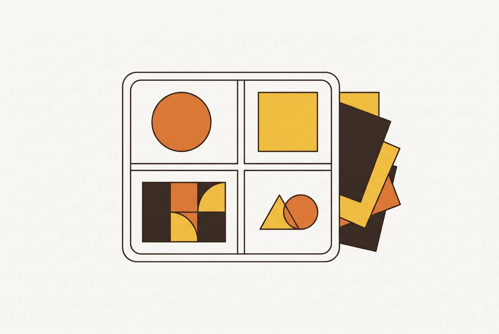
A style guide tells a team which blue to use. That difference in format, rules on a page versus assets ready to open, explains why most companies own a style guide and most companies still produce off-brand work every week. This piece walks through why that gap exists, what closes it, and what a brand kit needs to contain to actually get used.
Why style guides exist but rarely get used
Most companies have brand guidelines sitting somewhere, a shared drive, an onboarding folder, a tab nobody's opened since Q2. Fewer apply them with any consistency day to day. That's not because people forget the rules exist. The gap is a format problem, not a knowledge problem: a style guide describes what to do, and describing a rule still leaves someone to translate it into a finished file.
Constant Contact's guide to brand guidelines frames the document as answering "how do we do this?" A new hire opens the PDF, reads that the logo needs clear space equal to the height of the icon, and then has to go build a slide that respects that rule from scratch. A freelancer does the same. An AI tool does too, if it's even been pointed at the guide.
Multiply that translation step across every person who touches the brand, and drift is the default outcome of a system that hands out instructions instead of materials.
The contents and limits of a style guide
Give the style guide its due first, because the critique only lands if the thing being critiqued is good at what it does. The core components, outlined in Prezent's guide to brand style guides, typically include logo variations and file-type rules, a color palette specified in Pantone, CMYK, RGB, and HEX, typography with weights and minimum sizes, imagery and photography direction, and a defined tone of voice.
That's granular work, and it's necessary. A good guide spells out the clear-zone rule around a logo so nobody crops in too tight. None of that is filler, and none of it is easy to get right.
What it doesn't do is produce anything. The format gives the game away: a style guide is typically a PDF, a printed booklet, or a read-only page online. Quillbot's guide to brand kits draws a useful line here, calling brand guidelines the "brand bible," the document that explains how and why the brand looks the way it does, while a style guide proper is often narrower and focused on written standards. The guide will tell a salesperson which blue belongs on a slide. It will not give that salesperson a slide.
Closing the gap between rule and action
A brand kit doesn't throw out the style guide's rules. It operationalizes them, which is a clunky word for a simple move: instead of writing down the rule, hand over the asset that already follows it. The guide informs the kit. The kit is what actually gets opened on a Tuesday afternoon when someone needs a deck by 3pm.
Take the HEX #0057B7 example. A style guide states the code and moves on. A brand kit contains a slide template already built in that blue, with the approved font already set and the logo already placed in the correct position with the correct clear space. Nobody has to remember the rule, because the rule is baked into the file they're opening.
Photoroom and Quillbot point to a handful of pieces that make a kit actually function day to day. Secondary graphic elements, icons, patterns, a consistent illustration style, are often what makes a post recognizable even with the logo cropped out of frame. A short usage guide rounds it out, a plain list of what not to do: don't stretch the logo, don't drop it on a background that's almost the same color, don't swap in a font that wasn't approved.
The format difference matters: a brand kit lives inside a shared folder, a downloadable package, or a feature built into a design platform. It sits one click from use. Nobody reads it and then goes somewhere else to act on it, because the acting is what it's for.
Where brand enforcement breaks down without a kit
Drift doesn't happen randomly. It happens at predictable moments, specifically the moments when someone without design training gets handed a design decision the kit could have made for them instead.
Start with the freelancer or new hire. None of that is carelessness. It's what happens when the path of least resistance doesn't run through the approved assets.
Then there's the supplier. A print vendor or an event agency building signage or a banner will invent a shade of blue if nobody hands them exact CMYK values, and that's where brand consistency usually breaks first, right at the production boundary, outside the company's own walls where nobody's watching the file as it goes to press.
Social is maybe the slowest leak of all. Quillbot's brand kit guide names the specific upside a kit delivers against exactly this pattern: faster content creation because nobody's second-guessing a color choice, stronger collaboration because shared assets cut down on errors, and easier onboarding because new collaborators start from the kit instead of trying to reverse-engineer the brand from six months of old posts. One post that's slightly off is invisible. A quarter of posts that are each slightly off in a different direction is a brand that's quietly stopped looking like itself.
The highest-leverage component of a brand kit
Of everything sitting inside a brand kit, templates carry the most weight, because a template is the one format that embeds every other decision, color, type, logo placement, spacing, into the exact file someone's about to use. A color code sitting in a document still requires a human to apply it correctly. A template has already applied it. The person building the asset fills in a sentence, not a design.
For go-to-market teams specifically, four templates do most of the work: the sales presentation deck, a social post template for each channel actually in use, the email signature, and document templates for proposals and one-pagers and reports. The sales deck is usually a short structured story, problem, solution, proof, and a good template enforces the brand's visual system inside that structure while leaving the rep completely free to rewrite the content for whichever buyer they're pitching. Nobody's fighting the format to get their point across.
Social is where volume makes templates non-negotiable. Without one, every single post becomes a tiny design decision, and tiny design decisions made dozens of times a month compound into exactly the kind of drift the previous section described. One might argue that's a demotion. It's closer to the designer scaling themselves, because one well-built template replaces an unlimited number of future design requests.
AI-assisted design platforms push this even further. When brand elements are built into the platform's system, not just documented somewhere nearby, every output generated inside that system inherits them automatically. The template acts as a guardrail, already doing its job before anyone's typed a word.
How AI-volume environments make a machine-readable brand kit mandatory
What happens to a style guide once a team starts producing content faster than a human can review it? A document that depends on someone reading it, remembering it, and applying it by hand cannot keep pace with a team shipping assets across email, social, ads, decks, and web on a daily cadence. At that volume, asset-by-asset review isn't realistic, and the brand kit has to move from reference material into the actual tool doing the producing.
AI design tools make output faster, but speed isn't the same as brand accuracy. An AI tool doesn't automatically know the company's blue is #0057B7 and not whatever shade of blue is statistically most common in its training data. Left without a structured brand kit built into the platform, AI-generated output tends to default to generic: standard palettes, stock fonts, a logo that's technically present but repositioned somewhere it was never meant to sit.
The fix is encoding. Brand colors, fonts, logo variants, and template structures get entered into the design platform once, and from that point every asset generated inside the system inherits them without anyone having to check. The brand kit becomes the input the AI works from, not a separate PDF someone's supposed to remember to consult. For a team that isn't a large enterprise with a dedicated brand department, this usually means one person, a designer, a chief of staff, sometimes just the founder, sets the brand kit up once inside whatever platform the team already uses to build slides and social posts. Everyone else works inside that system without needing to memorize a single rule.
The payoff compounds in a direction that's genuinely unusual: the more a team produces inside a properly encoded system, the more consistent the output gets, not less. That's the exact opposite of what happens when volume meets improvisation, where more output just means more surface area for drift.
The strongest objection: a brand kit can scale the wrong identity
Fair challenge, and it deserves a straight answer rather than a dodge: a brand kit enforces whatever identity gets loaded into it. If the underlying positioning is muddled, unclear, or just wrong, the kit doesn't fix that. It reproduces the error, consistently, across every asset the team ships.
That raises the real risk. It can't identify a target audience, and it can't manufacture competitive differentiation out of a logo file and four color codes. Quillbot's brand kit guide makes a version of this point directly, noting that a brand kit needs to tie back to a clear brand purpose and a defined audience to actually land.
The sequencing is straightforward, though often skipped. Strategy comes first, what the company stands for, who it serves, how it's different. The brand kit comes third, the operational layer that packages the identity and gets it in front of the team. Templates and tools come fourth, the daily layer everyone actually touches. Skipping a step makes the skip more visible, faster.
If anything, this objection supports the article's argument. A style guide alone doesn't fix an unclear identity; it just describes that same identity in more detail. The brand kit is what makes a strategy, once it's actually settled, something a whole team can execute without a meeting every time someone opens a blank slide.
Building and maintaining a brand kit that teams will use
A kit earns its keep on three conditions: it has to be complete enough that nobody needs to improvise, easy enough to reach that it beats the alternative, and current enough that it hasn't quietly fallen behind what the brand actually looks like now.
The usage guide, a plain list, don't stretch the logo, don't use an unapproved font, don't place the logo on a background that's nearly the same color, catches most daily mistakes without requiring anyone to sit down and read the full style guide first.
Where the kit lives matters just as much as what's in it. A shared folder that requires switching tools and remembering a separate login gets skipped within a month. A kit built into the platform where the team already builds slides and posts gets used automatically, because reaching for it takes no extra step.
Teams forget to plan for maintenance. A brand kit goes stale the moment the visual identity shifts and the templates don't shift with it, so a kit update belongs inside any rebrand or identity refresh, not tacked on afterward as a separate project nobody schedules. And one mistake is common enough to flag directly: receiving only PNG exports from a designer or agency, with no editable source files behind them. Without those source files, the kit can't actually be adapted, and every future tweak means going back to the original creator, hat in hand, for a file that should have been handed over the first time.